When it Comes to Food Packaging Labels, Less is More
To better understand how consumer purchase decisions, Package Insight and QuadPackaging partnered to test sustainability messaging on paperboard products
Everyone knows Friday is the best day of the week. The long work week is drawing to a close and your alarm clock can usually be thrown out the window for a couple days. But for the Package Insight/Packaging School office, Friday means Foreign Food Friday, or #FFF as the kids call it. #FFF lunch is our outlet for some end-of-the-week fellowship while we explore the amazing melting pot of restaurants here in Greenville, SC, from delicious Thai food to vibrant Latin American cuisine. But truthfully, we do throw in the occasional burger or BBQ joint.
Regardless of the restaurant type, we’re all really creatures of habit; most often sticking with the same favorites without even giving the whole menu a once-over. Even though there are pages of new culinary opportunities waiting for us, we typically default back to what’s familiar or the easiest to blurt out when the server shows up at our table. Regardless of why we order the same thing time and time again, one thing is certain– that we are missing out on 99% of the menu real estate.
At lunch last Friday (shout out to the Pita House–10/10– would recommend), this got us talking about how navigating an intimidating menu parallels to consumers attempting to navigate overly complicated packages–We ARE packaging nerds, after all. With the barrage of logos, seals, and stamps on most consumer-packaged goods, it’s often difficult to fully understand products on retail shelves; almost like reading a foreign language.
To better understand how consumer purchase decisions and visual attention are influenced by sustainability logos, Package Insight and QuadPackaging partnered to test sustainability messaging on paperboard products. An eye-tracking study was performed utilizing CUshopTM, a fully-immersive, in-context, retail consumer-experience laboratory located on the Clemson University campus. Eye tracking was chosen as the primary methodology for this study because this technology offers insight into shoppers’ nonconscious decision making by recording eye movements and visual fixations.
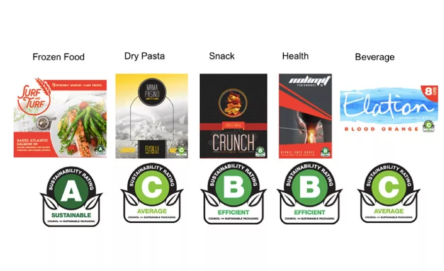
In this study, sustainability logos were applied to faux-brand paperboard packages in five product categories found within a typical grocery store. This unique logo was designed to replicate an inspection or grading scale (e.g. local public health department’s A-B-C grading of restaurants) and the validation of that grade by a larger objective entity (e.g. Brewers Association Independent Craft Brewer Seal).
A salt-and-pepper approach was implemented for this study, allowing us to efficiently test each claim against a baseline of 60 participants. With this method, one group of participants shopped for specific products with a claim and specific products without a claim. Then the claim/no claim packages were swapped for a second group of 30 participants. Each participant was given a prompt (i.e. “You are on a quick trip to the store on the way home”) and a shopping list (e.g. pack of beverages, pasta, snack, etc.) on which they would record their purchases. Eye-tracking data was gathered, continuously recording and pinpointing the participant’s visual and nonconscious attention at 50 times per second. This study generated more than 800,000 data points (60 participants @ 4m-average time spent in CUshopTM) that were then aggregated in our analyzer software to draw relevant conclusions.
Just like looking at a menu on #FFF, participants seemed overwhelmed during their shopping task. Even though the majority of participants self-reported that sustainability was an important concern to the them, a startling 92% said they did not notice the sustainability logo on any of the products of interest and participants who did report noticing the logo spent little to no time looking at it (as indicated by eye tracking data). Overall, there were very few significant attention differences found between the same products with a sustainability logo and those without.
Taking a deeper dive, we examined the actual badge on the primary display to see if consumers noticed it and eventually paid attention to it on the pack. Out of our group of 60 shoppers, only one participant noticed the badge on the beverage, snack, and pasta products, five participants noticed the badge on the health product, and zero participants noticed the badge on the frozen meal product. As for the participant who noticed the badge on the veggie crisps, it took 76 seconds to notice. Just think about that for a second: On average, consumers spend two to three seconds in front of a planogram making their decision. Noticing this badge on the bottom right of the package took 25-times longer.
So, how do we combat indecision and help our customers navigate the crowded grocery landscape and make informed choices? Take a cue from the restaurants. The best menu designs consider the “paradox of choice,” which states that the more options we have, the more anxiety we feel. What is the golden number, you ask? Seven options per food category–TOPS (seven appetizers, seven entrees, etc.). The world’s leading expert on menu engineering, Greg Rapp, states, “When we include more than seven items, a guest will be overwhelmed and confused, and when they get confused, they’ll typically default to an item they’ve had before.”
No restaurant wants confused diners, and the same goes for customers within the retail grocery space. Like well-designed menus, packages should have no more than seven elements, allowing the consumer to quickly focus on what is important on the package. If sustainability messaging is critical to the overall brand identity, make it part of the seven elements of importance on the primary display panel. Paul Nowak of Quad Packaging says it best, “Sustainability should be treated the same as all images used on packaging and reviewed like all brand and regulatory elements. Adding sustainability to standard creative and strategy packaging reviews puts it in the spotlight instead of relegating it to a secondary consideration.”
Like menus, packages should be designed with the end user in mind. Splitting a customer’s focus with too many call-outs creates frustration and confusion, at the moment of decision and can cost you client conversions. If you want to get someone to try something new, make it an uncomplicated choice. A large amount of both menu and package real estate goes unnoticed because of the sheer amount of items available for viewing. Simplifying your Primary Display Panel (or your menu) will take the stress out of that decision and give your customers confidence in the outcome.
Julie Rice, PhD, is academic director, The Packaging School in Greenville, S.C. Shannon Anderson is a project manager at Package InSight. Package InSight will be present this research at a QuadPackaging sustainability symposium in Milwaukee in November.
Looking for a reprint of this article?
From high-res PDFs to custom plaques, order your copy today!