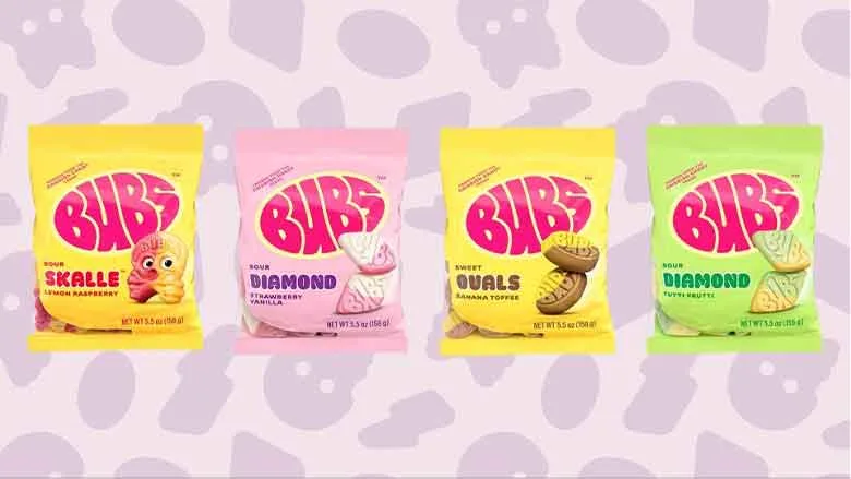
Cereals Make Millennial Appeal
Cap’n Crunch recently released limited edition offerings designed to appeal more to an older, male-centric demographic
Cap’n Crunch cereal has a new target: the man-child. In case you’re unfamiliar with him, he is a millennial man between the ages of 18 and 30 who is tech savvy, cares about what he wears and exudes a sense of irreverence towards society. Recent market research has shown that morning is no longer the primary time when cereal is consumed, and young adults now consume it just as much as kids.
With this change has come a shift in marketing, especially in package design. A prime example is Cap’n Crunch, a brand that has recently released limited edition offerings designed to appeal more to an older, male-centric demographic. Cap’n Crunch has taken a clever approach to its branding and package design strategy, appealing to its new target demographic by introducing hidden pop-culture references to its graphics. While enjoying a bowl of Cap’n Crunch, young adults can be just as engaged as kids, eagerly searching for the many references to contemporary movies, shows, trends and viral content from social media concealed in the artwork.
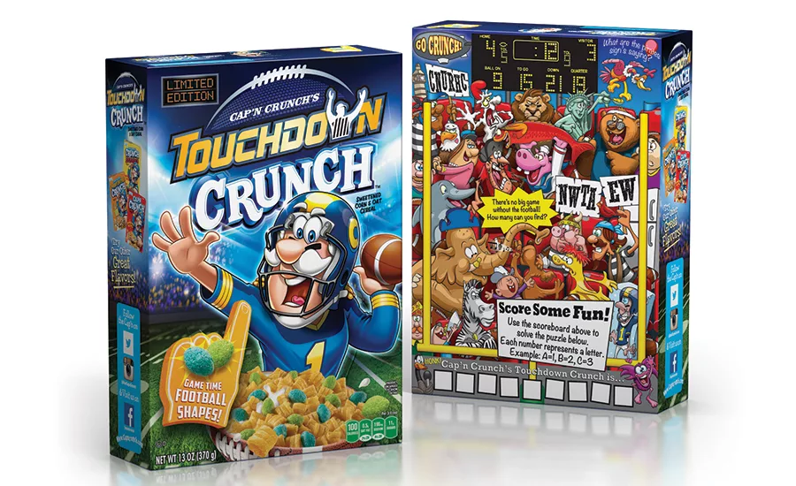
Haugaard Creative was charged with refreshing graphics for the Touchdown Crunch, which was last seen on shelves in 2009. The Cap’n is illustrated in a full uniform and features an enthusiastic expression as if he’s in the middle of a big game, while the football field was rendered to appear much more realistic. Touchdown Crunch can be found in two sizes, Jumbo and Super Jumbo, at select retailers.
With this change has come a shift in marketing, especially in package design. A prime example is Cap’n Crunch, a brand that has recently released limited edition offerings designed to appeal more to an older, male-centric demographic. Cap’n Crunch has taken a clever approach to its branding and package design strategy, appealing to its new target demographic by introducing hidden pop-culture references to its graphics. While enjoying a bowl of Cap’n Crunch, young adults can be just as engaged as kids, eagerly searching for the many references to contemporary movies, shows, trends and viral content from social media concealed in the artwork.
Haugaard Creative was charged with refreshing graphics for the Touchdown Crunch, which was last seen on shelves in 2009. The Cap’n is illustrated in a full uniform and features an enthusiastic expression as if he’s in the middle of a big game, while the football field was rendered to appear much more realistic. Touchdown Crunch can be found in two sizes, Jumbo and Super Jumbo, at select retailers.
Looking for a reprint of this article?
From high-res PDFs to custom plaques, order your copy today!