Nightfood Unveils New Packaging with Increased Emphasis on Sleep-Friendly Benefits
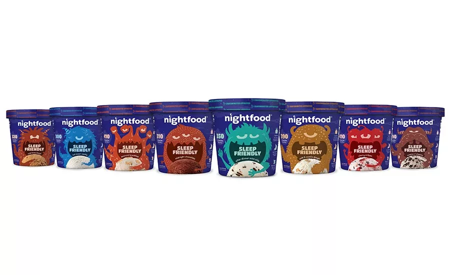
The front panel of the package is singularly focused on communicating Nightfood’s “sleep-friendly” nutritional profile
Nightfood, Inc., a company pioneering the category of better-for-you nighttime snacks formulated for better sleep, recently provided the public a first look at the brand’s new packaging.
The updated packaging features Nightfood’s familiar Cravemonsters™ in a bold new design. All flavors share a new deep blue background for stronger shelf-presence while delivering additional nighttime cues to the consumer.
Most importantly, the front panel is now singularly focused on communicating the brand’s unique point of differentiation and key consumer benefit: Nightfood’s “sleep-friendly” nutritional profile.
Nightfood used the phrase “sleep-friendly” to describe snacks formulated with a focus on delivering the nutritional foundation for a better night of sleep. Some of the sleep-friendly characteristics of Nightfood ice cream include more prebiotic fiber, casein protein, calcium, magnesium, and zinc when compared to regular ice cream, as well as less sugar, less fat, and fewer calories. These attributes are called out in detail on the back of each pint.
The packaging updates were made based on information gathered during Nightfood’s first 18 months on shelf in major supermarkets. During that time, the company has sold hundreds of thousands of pints, collected thousands of consumer reviews, and conducted in-depth interviews with heavy users and early adopters.
The Nightfood packaging update was executed by OffWhite Co., the design firm behind the iconic packaging designs of Chobani and Maple Hill Creamery. Their work with Chobani helped drive sales from $30 million to crossing the billion-dollar mark in under 4 years, becoming the #1 yogurt brand.
Looking for a reprint of this article?
From high-res PDFs to custom plaques, order your copy today!