Mayfield Creamery Recharges Brand
Restoring the brand name to the original Mayfield Creamery was the first step in transitioning the brand to showcase its authentic positioning
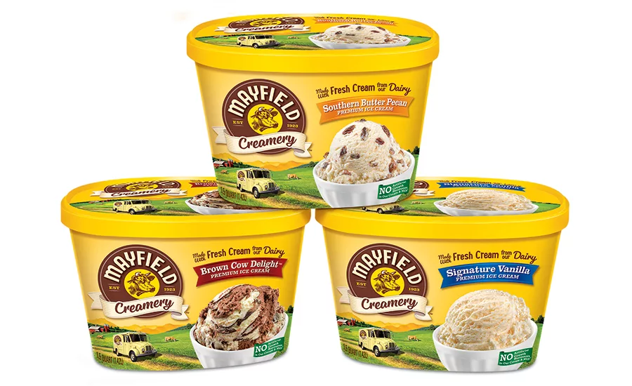
Dean Foods is re-staging of its iconic ice cream brand Mayfield Creamery with a new logo and packaging graphics across its 60+ SKUs, designed by branding agency Hughes Design Group. Since 1923, Mayfield Creamery has been crafting quality ice cream with family recipes and fresh cream from their own dairy. The new restage restores the brand’s original name (Mayfield Creamery) as it expands into new markets in Texas, Oklahoma, Arizona and New Mexico.
Looking to expand its ice cream business, Dean Foods sought to gain a deep understanding of the brand among both its core users as well as with consumers who had never experienced the brand. The research revealed that one of the challenges was that the current packaging appeared dated and failed to create an emotional connection to the brand. To re-engage the core audience and establish itself in new markets, Dean Foods realized the packaging needed to work much harder to emphasize Mayfield Creamery’s key points-of-difference: Being made with fresh cream from its own dairy, along with the 94-year family back story.
The comprehensive brand refresh began at the original Mayfield Dairy Farm, located in Athens, Tenn. “Our objective was to re-energize the brand by bringing the core equities such as the Southern dairy heritage, being made with fresh cream from our own dairy, timelessness, and idyllic sense of place to the forefront,” says Mark Schneider, ice cream marketing director for Dean Foods.
Restoring the brand name to the original Mayfield Creamery was the first step in transitioning the brand to showcase its authentic positioning. “We opened ourselves to a range of options for a refreshed logo and as the process evolved. We saw amazing opportunity to elevate the brand with a return to the ‘Creamery’ naming,” says Schneider. The new logo was designed with a natural sensibility, evoking the iconic circular Mayfield Dairy Farm logo consumers were familiar with and infusing it with contemporary appeal.
While the yellow brand equity color was synonymous with Mayfield and brand blocked on shelf, it appeared brassy and unappetizing. “By evolving the color palette to a warm, golden yellow, we made the brand more indulgent and premium, and added to the taste appeal of the product imagery,” says Greg Martin, creative director of Hughes Design Group.
With a new logo and warmer equity color, Mayfield Creamery still needed an architecture that could authentically highlight the brand story. To visually transport consumers to the charming world of Mayfield Creamery, Hughes crafted a custom illustration featuring a classic Mayfield delivery truck and farm-fresh scene set against the foothills of the Smoky Mountains. “We wanted to reinforce the Southern farm roots of the brand…the truck is a subtle reference to the delivery of fresh dairy ice cream to your door,” says Martin.
To better infuse the history of Mayfield Creamery into its branding and packaging, Hughes underwent a brand immersion experience with Scottie Mayfield, the grandson of Mayfield’s founder, T.B. Mayfield. Hand-drawn illustrations of family photos, original product images and dairy barn Scottie shared appear on the back of every package. “I really love how integrated all of the elements are on the front and back of the packages to vividly tell the story of Mayfield Creamery ice cream,” says Schneider.
In addition to its classic flavors on shelves now, Mayfield Creamery also has launched a range of novelties and new flavors appealing to modern tastes, such as a sea salt caramel cheesecake and lemon ice box pie. The new branding will also appear on a variety of limited offerings released over the course of the next year. “The new branding and packaging has already received a warm and enthusiastic response from retailers,” says Schneider. “We look forward to consumer reactions in the coming months.”
Looking for a reprint of this article?
From high-res PDFs to custom plaques, order your copy today!